5 top tips from beautiful intranet homepages
Your intranet homepage sets the expectation of your site. Get it right and users are inclined to click through to content and keep coming back to see what is new.
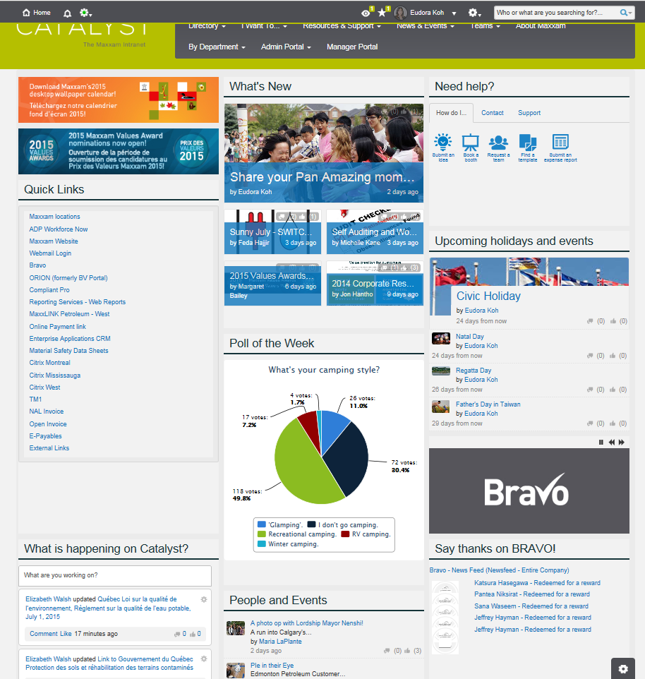
How Maxxam’s intranet homepage went from where? to wow!
Eudora Koh shared an excellent transformation of Maxxam Analytic’s homepage in her Intranet Excellence Awards 2015 entry for Best Intranet Design and Brand.
Maxxam originally had an intranet homepage typical of many of us; it’s not as easy as employees need it to be resulting in employees reverting back to old ways of working. Although there was plenty of good activity being shared on Maxxam’s intranet homepage, the user had to work at understanding what was going on where:
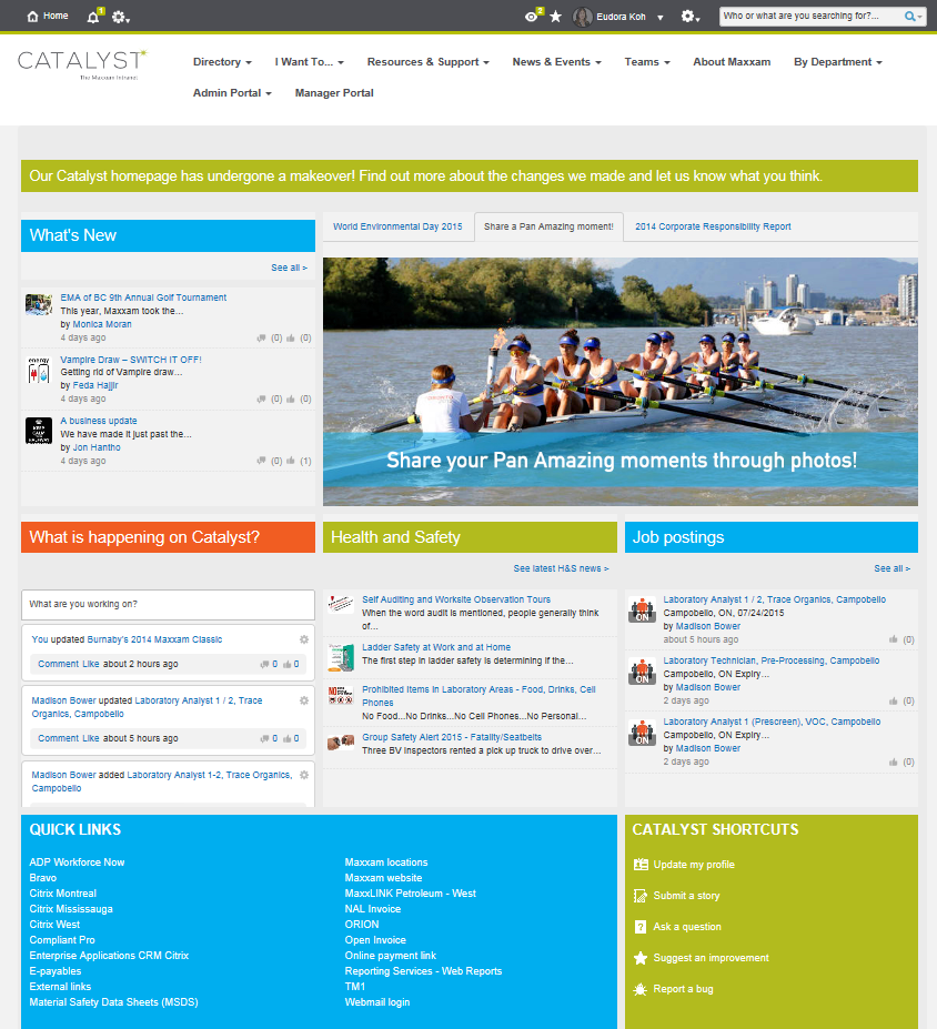
However, when Maxxam reinvented their intranet homepage, the results were incredible. Users can now instantly understand what is happening where and what they need to do:
It looks amazing, so what did they do? Follow these five simple pointers to put yourself on a path to intranet homepage success:
1) Balance your intranet homepage
Maxxam’s site is well-balanced with content segmented into a logical flow. Try to think of your homepage in themes; if those themes are grouped together, people will understand that this is where a certain activity happens.
Take this example by David Newell of Canterbury City Councilwith their intranet iCan:
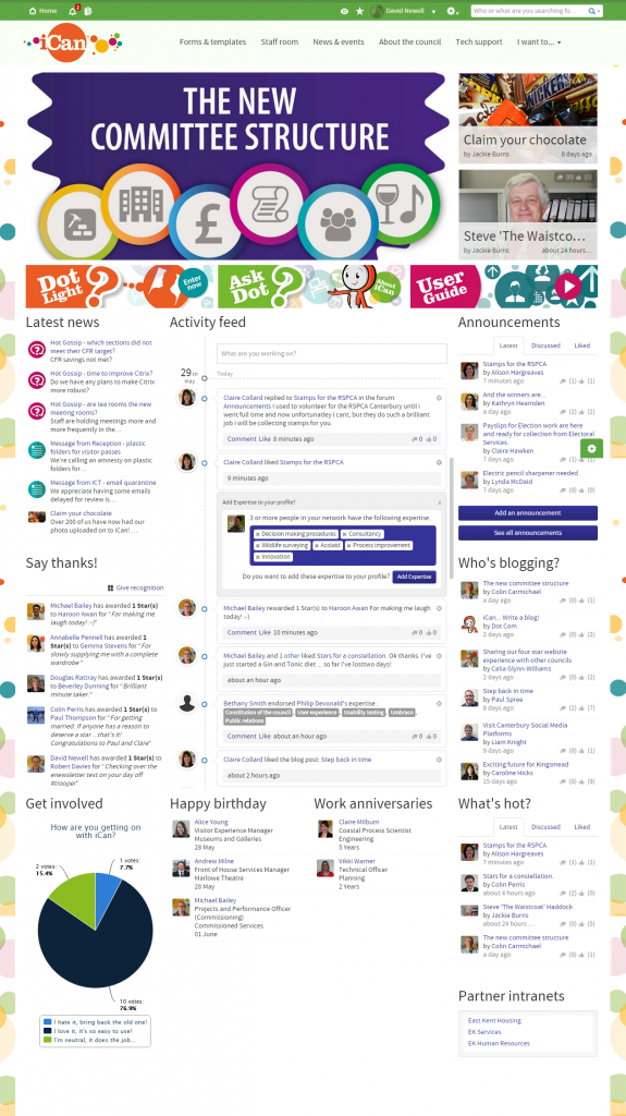
With symmetrical widgets, clear calls to action and consistent theme placement, it’s easy to see why they have such a high adoption rate.
Similarly a strong use of images gives the homepage a wow factor, this is a great way to change the look of your homepage.
2) Use video, galleries and imagery to give your intranet homepage greater visual impact
A well positioned image, gallery or video towards the top of your intranet homepage will instantly provide a format users recognise. The more likely they are to make that first click, the more quickly they will get an intranet addiction which will see your site becoming the first place they come to get work done.
Take a look at Will Burnett’s approach with The Voice at Oxford Innovation, it’s easy to see why their site is such a hit:
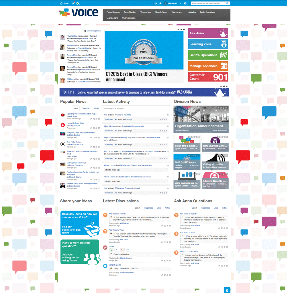
Will has managed to create a vibrant, but not overbearing theme that looks engaging and interesting.
3) Keep your intranet homepage bright, but not overbearing
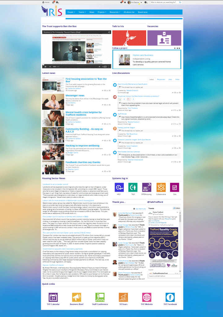
Stephen Lynch at Trafford Housing Trust has worked hard to make sure the images on their intranet, Iris, make an impact. Each has its own unique space so the user’s eye takes a natural journey between items as they view the intranet homepage.
Latest news has a distinct look which you would expect from any of the major news sites around the world:
4) Make it easy to see what is going on on your intranet homepage
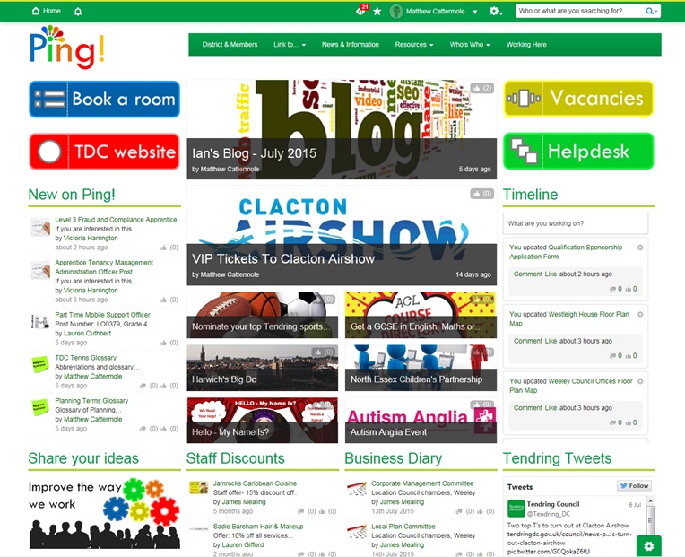
Limiting yourself to a set number of widgets keeps your intranet homepage focussed. Matthew Cattermole’s work at Tendring District Council on their intranet, Ping! is a good example of not overwhelming your users with content:
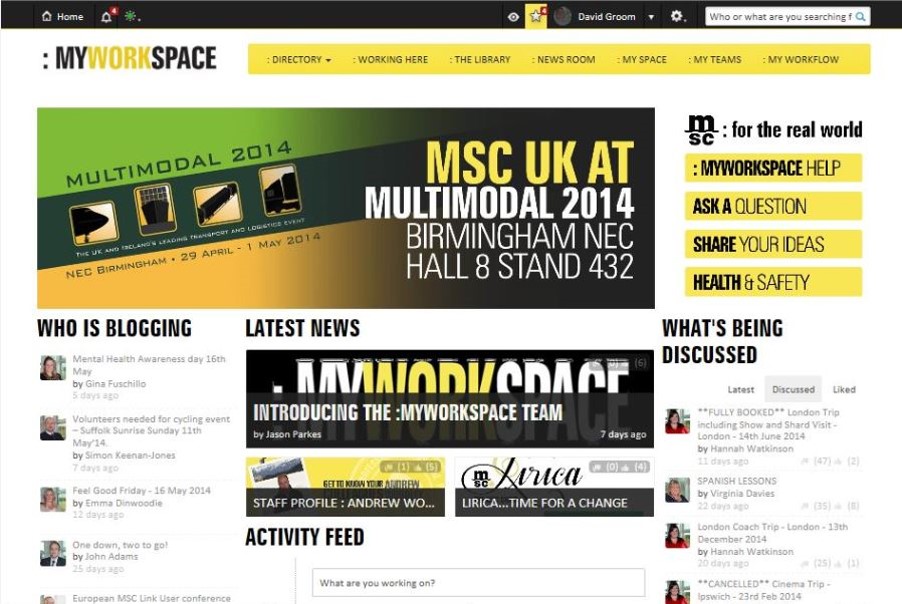
Whilst plenty of dynamic activity is occurring through most widgets, buttons cater as shortcuts for the most common user actions upon the site. This is something that served MSC UK well with their intranet, MySpace which was the Ragan Best Intranet Design Award winner in 2015:
5) Use an engaging intranet homepage background
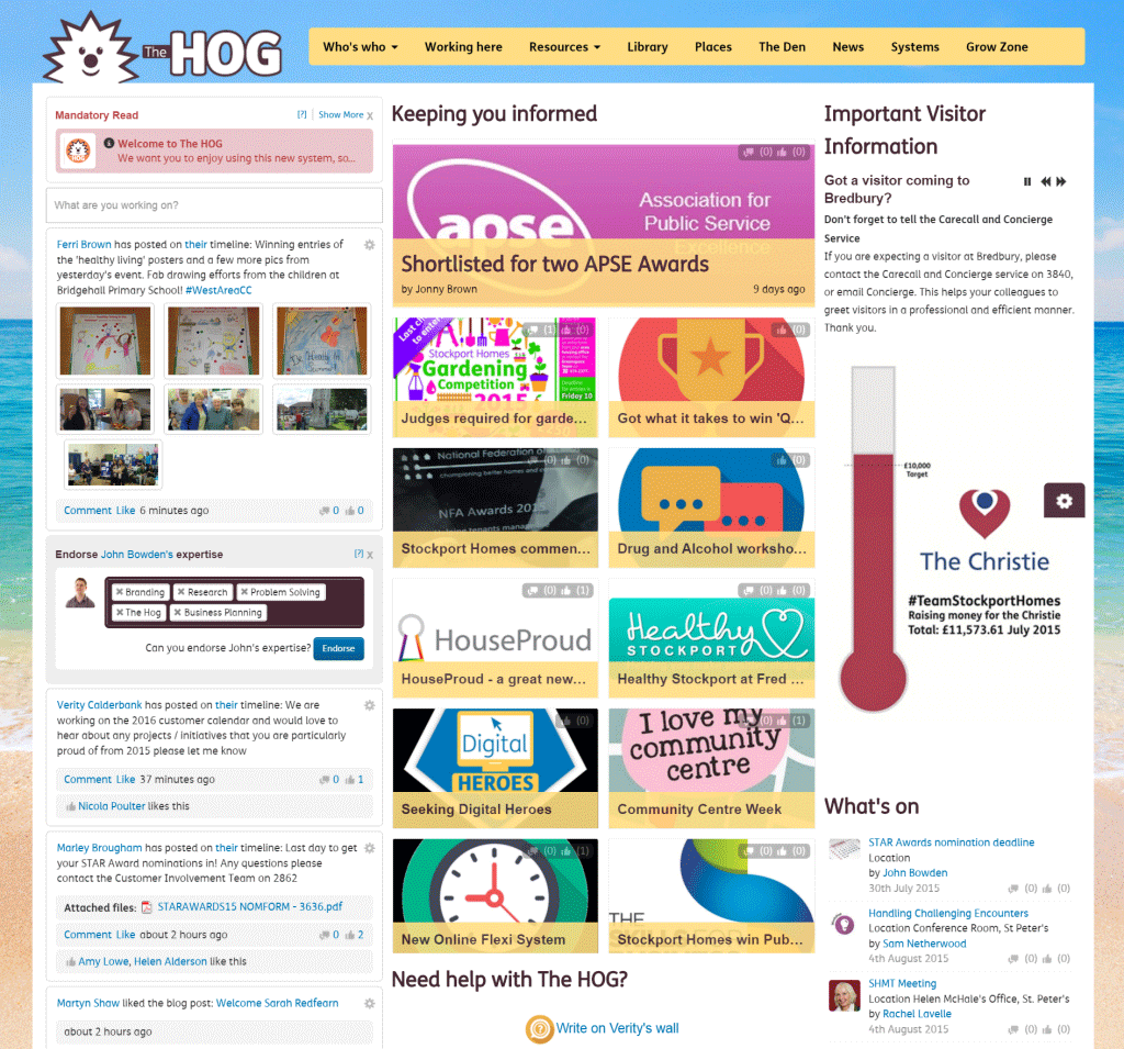
We are seeing an increase in customers using themes, which dramatically improves the aesthetics of your site. Verity Calderbank at Stockport Homes changes their site, The HOG, with the seasons. This is their summer look:
You Might Also Like
 News
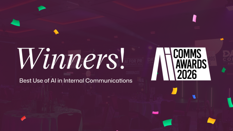
News Award-winning AI: Kent and Interact recognized at the AI Comms Awards 2026
Kent and Interact are celebrating after winning Bronze in the Best Use of AI in Internal Communications category at the AI Comms Awards 2026, recognizing…
 Blog
Blog AI Search optimization tools: why the frontline gains most
AI Search optimization tools mainly help knowledge workers, and rising search volume proves this – that’s the conventional wisdom right now. But Interact’s proprietary…
 Blog
Blog The enterprise AI governance gap: Why so much AI isn’t enterprise-ready
Enterprise AI governance isn’t keeping pace with AI adoption. Organizations are deploying AI tools at speed, and HR, IT, comms, and senior leaders are discovering that the technology they…
 News
News Interact Enters a New Era of Growth with Brand Evolution, AI Innovation, and Industry Recognition
A landmark quarter brings a new visual identity, agentic AI capabilities, and recognition across the category's leading analyst reports.